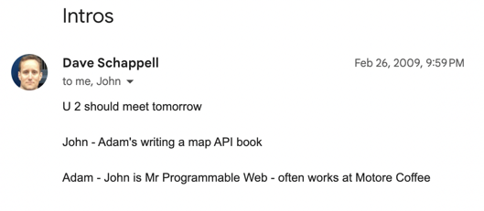
A couple of minutes after noon on February 27, 2009, I was sitting at the counter of Motore Coffee in Seattle. I was two months into writing my first book. The topic, mapping APIs, got me an introduction to John Musser, founder of ProgrammableWeb.
Less than a month later, John published my first post on his site. The first of 837 articles I eventually wrote following the rise of APIs. The meeting and my work at ProgrammableWeb was a turning point in my career, which now has me working with companies to better engage their technical audiences with content.
Earlier this month, the current owner of ProgrammableWeb redirected all of the traffic to a page that explains it’s been shut down. With the help of the Internet Archive’s Wayback Machine, I went back to find some of my impactful posts, at least to me. In this post, I’ll share nine of those 837—a little over 1%, for those keeping track.
Rubbing Elbows with Siri and Popular Apps
Before Siri was the household name of Apple’s built-in voice assistant, it was an app. Thanks to connections I made at Wired and ProgrammableWeb’s stature as the API place, I got to use Siri under embargo.
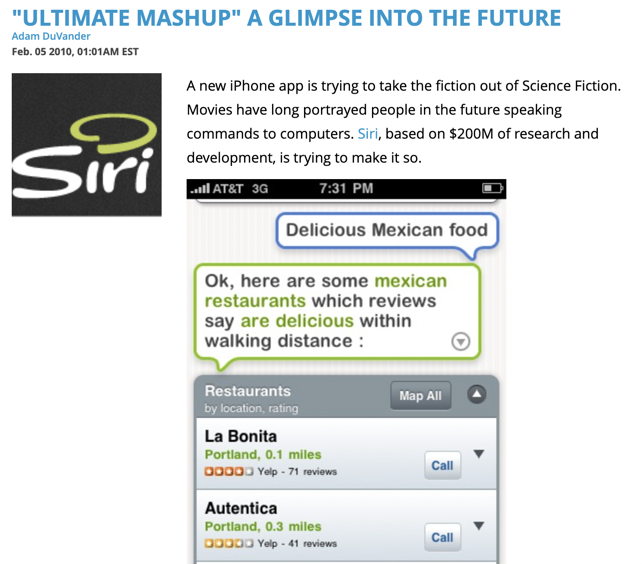
The founders called it the “ultimate mashup” and walked me through all the APIs it used. Reading through my Siri coverage, it’s fun to see what came true with voice assistants and the distance they still have to go—the bit about making transactions sticks out to me.
The Siri news might have been my first ProgrammableWeb news embargo, where I had to keep quiet until a specific time we were allowed to publish. With several days heads up, I even created a video walkthrough. I swear the text on the screen was readable originally!
Another popular app with an API angle came later that year.
Instagram surged in usage in late fall 2010. Everyone was excited about the experience on their phones, but there was no other way to connect to your photo stream. There wasn’t even a web view at that point, meaning you couldn’t share outside the app.
It was limiting… and as they often do, a developer decided to build anyway.
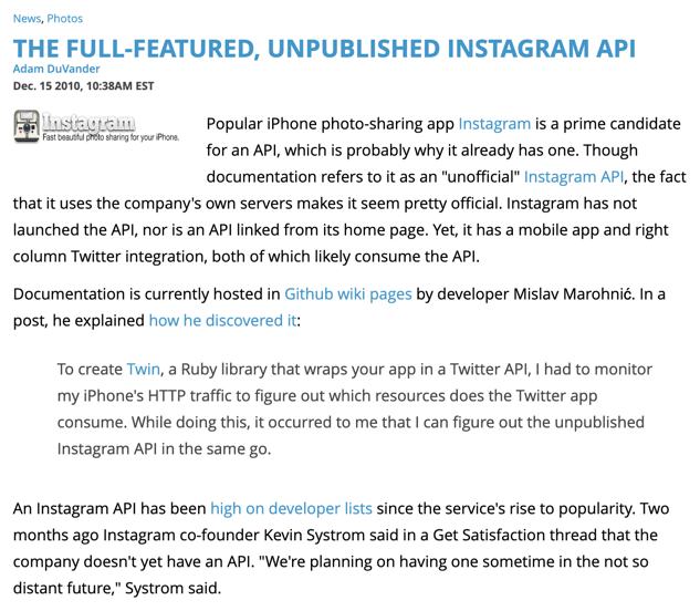
Using a proxy, the dev reverse-engineered the private API used by Instagram’s app. Then he hosted documentation and a Ruby library on GitHub as a public service for other devs that wanted to build on Instagram.
I’m pretty sure this was a scoop, one I found from reading tweets about APIs. No other publications were picking up stories like this at that time. It meant I got to trade emails with Instagram co-founder Kevin Systrom as I covered the story in follow-up posts. For several months, ProgrammableWeb owned the search results for “Instagram API.”
The biggest single day of traffic came from a post that took me seven or eight minutes to write. I was searching through Twitter again, reading every single tweet with “API” in it—that was possible at the time. My goal was to write a “Today in APIs” roundup of news, but one tweet jumped out to me as worthy of its own post:
Backend-as-a-service company Parse encouraged engineers to “apply via API,” sending their information in JSON rather than through a form or email. It was novel, it was fun, and the post instantly got attention.
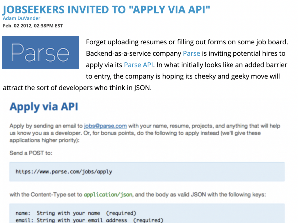
A week later, Parse co-founder James Yu told me, “I felt like every mobile developer in the valley was probably talking about Parse that night.” A year later, Parse was part of Facebook. So was Instagram. The other popular app, Siri, was of course purchased and incorporated into Apple’s operating system.
Were these three successful because of their ProgrammableWeb coverage? Maybe so. 😉
Reporting on Data Only We Had Collected
It was fun to cover big news, creative apps, and other API-related topics. Even after joining full-time in 2010, it took some time for me to appreciate the directory side of the business. Looking back, the biggest opportunities at impactful, creative work were when I combined the news and the directory.
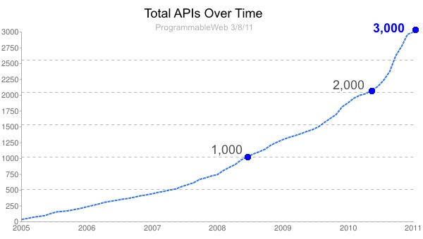
The first time I really dug into the data was when ProgrammableWeb approached 3,000 APIs. At the time it seemed like a huge number. Before the site shut down, there were more than 20,000 tracked. My 3,000 APIs post calls out API as a company, JSON, and internal usage as trends.
For years afterward, I’d see that hockey stick API growth chart in dozens of presentations at conferences. Several people told me they included it in fundraising decks.
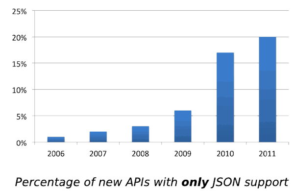
It’s admittedly pretty nerdy, but I also really liked tracking the data formats supported by APIs. Again, this was data nobody else had, especially when you consider the value of historical data. We could look at formats by year, by API category, and any sort of combination we wanted to pull from the database.
I’m pretty sure the “bye XML” post was a collaboration with John after one of his talks. Everyone loved learning from directory insights and I wanted it to go beyond the few hundred people in the audience. Being the first audience for John’s analysis was also fun and taught me a lot about finding stories within trends.
Though I did a lot of trend-chasing at ProgrammableWeb, I also got to take on topics just because they were fun for me.
Following the Fun and Interesting Stories
Being editor of ProgrammableWeb meant I saw all sorts of news cross my desk each week. Most we couldn’t cover, a few topics got picked up by our freelancers, and I chose to follow a handful on my own. Before I joined full-time, I assume John did a lot of this filtering on his own. One of my favorites came early into my time as lead writer.
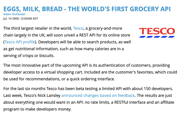
Firstly, it’s a pretty good headline. Mostly I love this post for the future possibilities it sees for APIs. It had access to store inventory, safe authentication to a customer’s cart, and even a way to make developers money. A grocery API was notable in 2009 and it seemed like a glimpse of what would be normal in just a few short years.
Possibility was also in the air the next year at SXSW. I was already attending, but the ProgrammableWeb connection also got me a press pass. I took my coverage seriously and spent a significant time under the Circus Mashimus tent.
Mashery had representatives from several of their customers in one room. In particular, the Best Buy DVD mashup sticks out: the company flew a developer out to talk about what he built with its API. This was precisely the ProgrammableWeb audience at the time, so I excitedly asked him to tell me his story, which I captured on video.
If I could have told stories like that every day, I would have. That developer excitement got me excited.
In fact, my very first post on ProgrammableWeb was about sharing something fun a local Portland developer created:
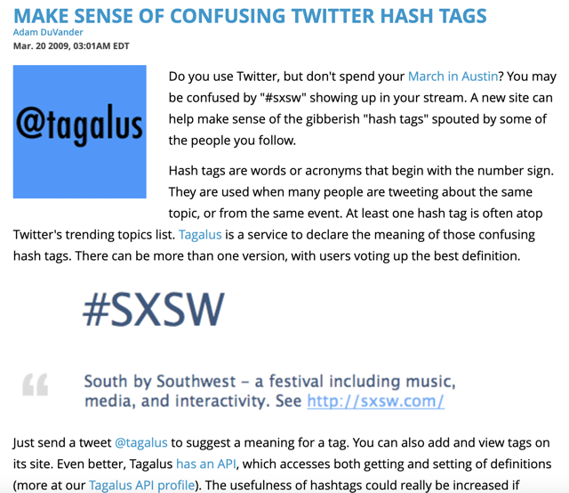
Twitter had become big just two years earlier at SXSW, so I used that example for a hashtag service I’d likely seen covered by Silicon Florist. “Tagalus,” now long gone, crowdsourced definitions of hashtags, still a fairly new concept. Not only did Tagalus use the Twitter API, but it also had its own API, making it a no-brainer topic for ProgrammableWeb.
The End: Part I
Just a few years later, I’d written 800-ish posts and ProgrammableWeb was searching for a buyer. I was ready for a change and was uncertain whether the publication could maintain its unbiased approach under an API management vendor.
I supported—and then reported—the Mulesoft acquisition, but did not join as an employee. I stayed on as a Contributing Editor for a year and wrote some great analyses with the agreement of my new employer, SendGrid.
Mulesoft’s stewardship of ProgrammableWeb was a pleasant surprise and it lasted a good long while. I’m obviously sorry to see the industry resource go and, personally, I no longer have an archive of my stories from that time.
Here are the nine mentioned in this post, in chronological order:
- Make Sense Of Confusing Twitter Hash Tags
- Eggs, Milk, Bread – The World’s First Grocery API
- “Ultimate Mashup” A Glimpse Into The Future
- DVD Collector Remixes Best Buy API to Share Compilation
- The Full-Featured, Unpublished Instagram API
- 3,000 Web APIs: Trends From A Quickly Growing Directory
- 1 In 5 APIs Say “Bye XML”
- Jobseekers Invited To “Apply Via API”
- ProgrammableWeb Joins MuleSoft
And 828 others on the archive of my profile page.