• Skip to primary navigation
  • Skip to content
  • Skip to primary sidebar

Simplicity Rules

Adam DuVander on keeping it simple

  • About Adam

The Four SkinnyCorp Commandments

February 13, 2007 by Adam DuVander

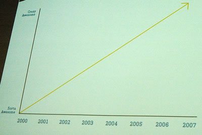
SkinnyCorp is the company behind the community-created tshirt website, Threadless. They let the audience in on their major metric for determining their company’s growth (thanks to Brian Oberkirch for the pic).

SkinnyCorp growth

To achieve their success, they have lived by only Four SkinnyCorp Commandments.

  1. Allow content to be created by the community. Every shirt design came from the Threadless community, who also vote on each shirt. The best get made and then purchased by the same community.
  2. Put your project in the hands of its community. Most of the new features on Threadless are also ideas from the community, sometimes executed upon in less than one day.
  3. Let your community grow itself. Give them an incentive to stick around and they’re bound to tell their friends.
  4. Reward the community that makes you project possible. Winning shirt designers get $2,000. As Threadless has become more popular, the amount has gone up.

Community Next week in lists

February 13, 2007 by Adam DuVander

This weekend I spent a day at CommunityNext, a set-menu conference with a great line-up. I learned some great things about community, some of which I look forward to sharing during the week in lists.

First up, The Four SkinnyCorp Commandments.

Craigslist redesigns

February 11, 2007 by Adam DuVander

It’s one of the largest sites around. Everybody knows and loves what Craigslist does. But most designers will tell you they don’t like how Craigslist looks.

Here’s the current site, in all its textual, link-happy glory:
Original Craigslist design

In 2004, Charlie Park thought he’d try a redesign. He certainly wasn’t the first to think about it, but his is the earliest I could find. Here’s what he came up with:
Craigslist redesign - circa 2004

The blues went to red and the site gained a little more white space breathing room.

Then about a year ago, a panel at the South by Southwest Interactive conference made a splash with this:
Craigslist redesign 2006 SXSW

It has even more white space, slightly bigger fonts, and a happier blue link color.

Christian Montoya started with the SXSW redesign, shrank the header and added a whole lot of thin grey lines or borders:
Craigslist redesign - tweaks 2006

Matt Haughey also worked off the SXSW redesign. Mainly, he thinks “the top bar is all wrong:”
Craigslist redesign - mathowie tweaks 2006

It’s interesting that while all these redesigns attempt to make Craigslist look and feel differently, none really attacked on the information clutter. Of course, that may be because there isn’t a much simpler front page for Craigslist without increasing the number of times their users have to click.

Could Craigslist be a better experience if it looked better or acted differently? Does that mean they should go for it?

If it ain’t broke, don’t fix it, right? The biggest reason that Craigslist will probably never consider any of these–or their own–redesigns is that they don’t really need to.

Did I miss any? Let me know if you know of any other Craigslist redesigns.

Examples of expected behavior

February 3, 2007 by Adam DuVander

There’s a really great point in the middle of Nick Harris’ post on creating a pleasant user experience:

Asking users to break their habits in order to use your software is a really tough sell.

He goes on to give some great examples, my favorite of which is breaking the back button. In fact, I’m realizing now that we did just that with the refund project and I’m wondering whether we really had much of a choice.

The point here is it doesn’t really matter if I’ve made a choice based on code efficiency or if I think some convention is wrong. If the program model isn’t in line with the user model, I’m making things easier on me instead of the people who matter.

WiFi ubiquity doesn’t stop searching

February 2, 2007 by Adam DuVander

It seems that even though there are more hotspots than ever in Portland, people still want to find the closest, best WiFi. I get several calls a week from people who think I’m MetroFi, the blanket WiFi company.

WifiPDX traffic, July - January

It’s smalltime traffic, but it’s still great growth. It’s two times July’s numbers and has me optimistic about continuing to build a useful site.

In the meantime, some popular spots:

  • The Press Club
  • The Waypost
  • Muddy Waters Coffeehouse

I haven’t been to any of these. I’ll have to try them out.

  • « Previous Page
  • Page 1
  • …
  • Page 41
  • Page 42
  • Page 43
  • Page 44
  • Page 45
  • …
  • Page 85
  • Next Page »

Simplicity Series

  • Designing the Obvious
  • Paradox of Choice
  • Laws of Simplicity

Copyright © 2025 · Elevate on Genesis Framework · WordPress · Log in